
28 Oct The Living Atlas of the World
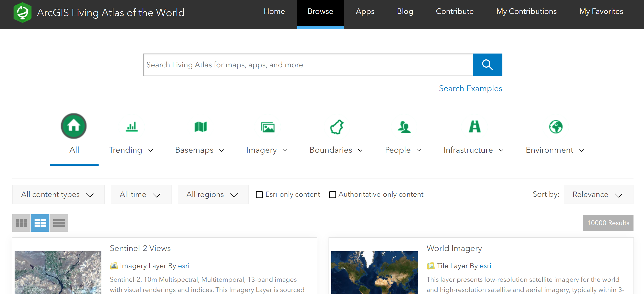
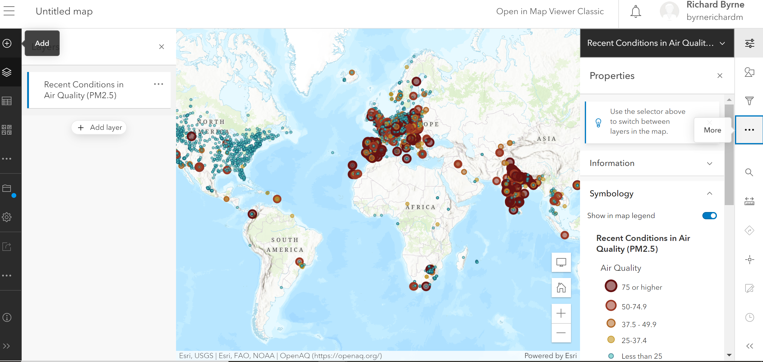
The ArcGIS Living Atlas of the World is a collection of thousands of online, interactive maps representing all kinds of data. The contents of the collection range from relatively simple displays of historical map imagery to complex, displays of data updated nearly live. For example, this map displays active hurricanes, cyclones, and typhoons. Another good example is this map that displays current air quality conditions around the world.
All of the maps in the ArcGIS Living Atlas of the World include links to the sources of the data displayed, a description of the data, and an update date. Additionally, some maps include a glossary of terms and links to lessons for learning about mapping data with ArcGIS. For example, the air quality map mentioned above includes a link to this lesson plan about mapping data in realtime.
You can browse and search the ArcGIS Living Atlas of the World according to content type, creation and update date, and regions of the world. Additionally, there is an option to limit research results to only content produced by ESRI (the makers of ArcGIS) and content that is labeled as “authoritative only.”
Applications for Education
The ArcGIS Living Atlas of the World can be a great place to find examples of mapped data sets to use in your lessons. The real-time nature of many of the maps can be used to have students analyze and form predictions. Of course, it’s always helpful to have a resource that shows students where in the world the events and patterns they’re reading about are happening.
The ArcGIS Living Atlas of the World is a collection of thousands of online, interactive maps representing all kinds of data. The contents of the collection range from relatively simple displays of historical map imagery to complex, displays of data updated nearly live. For example, this map displays active hurricanes, cyclones, and typhoons. Another good example is this map that displays current air quality conditions around the world. All of the maps in the ArcGIS Living Atlas of the World include links to the sources of the data displayed, a description of the data, and an update date. Additionally, some maps include a glossary of terms and links to lessons for learning about mapping data with ArcGIS. For example, the air quality map mentioned above includes a link to this lesson plan about mapping data in realtime. You can browse and search the ArcGIS Living Atlas of the World according to content type, creation and update date, and regions of the world. Additionally, there is an option to limit research results to only content produced by ESRI (the makers of ArcGIS) and content that is labeled as “authoritative only.”Applications for EducationThe ArcGIS Living Atlas of the World can be a great place to find examples of mapped data sets to use in your lessons. The real-time nature of many of the maps can be used to have students analyze and form predictions. Of course, it’s always helpful to have a resource that shows students where in the world the events and patterns they’re reading about are happening. Here’s my video overview of The Living Atlas of the World.  ArcGIS, atlas, Free Technology For Teachers, Geography, Living Atlas of the World, Mapping, Maps, Social StudiesRead More
Sorry, the comment form is closed at this time.