27 Mar Seven Tips for Good Infographic Design
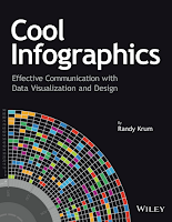
Last week Canva made waves on social media with all of their announcements about their new AI-powered design tools. While those tools look great and I plan to use them, I think it’s still important for students to learn some basic design principles instead of just relying on whatever an algorithm spits out. To that end, here’s an excerpt from a review that I wrote of Randy Krum’s book, Cool Infographics published back in 2013.
2. Tell one story really well. An infographic that tries to do too much ends up not telling a story at all.
3. The 5 second rule. Krum shares that most of the page view duration times are 5-10 seconds for infographics featured on his blog. Create infographics that tell a story quickly.
4. Big fonts are not data visualizations. Krum states, “displaying the number in a large font doesn’t make it any easier for the audience to understand.”
5. Minimize text. Along the lines of #4 above. This is another tip that seems obvious, yet we see text-heavy infographics all over the web.
6. Eliminate chart legends. If the viewer needs a legend, your infographic’s story might not be as clear as it should be.
7. Pick a good topic. Some topics are not as suitable for infographic display as others.
Disclosure: I received a free press copy of the Cool Infographics book.
Are you a tech coach or media specialist looking for some new ideas to share with your colleagues? If so, 50 Tech Tuesday Tips is an eBook you need. You can get it right here.
Last week Canva made waves on social media with all of their announcements about their new AI-powered design tools. While those tools look great and I plan to use them, I think it’s still important for students to learn some basic design principles instead of just relying on whatever an algorithm spits out. To that end, here’s an excerpt from a review that I wrote of Randy Krum’s book, Cool Infographics published back in 2013. In his book Randy Krum goes into much more detail on each of these key elements of good infographic design. These are the elements of good design that he outlines in his chapter about designing infographics. You can get a sample chapter of the book here.1. Be accurate. It seems obvious, but you will find infographics are not accurate. For example, make sure your pie charts add up to 100%.2. Tell one story really well. An infographic that tries to do too much ends up not telling a story at all.3. The 5 second rule. Krum shares that most of the page view duration times are 5-10 seconds for infographics featured on his blog. Create infographics that tell a story quickly.4. Big fonts are not data visualizations. Krum states, “displaying the number in a large font doesn’t make it any easier for the audience to understand.”5. Minimize text. Along the lines of #4 above. This is another tip that seems obvious, yet we see text-heavy infographics all over the web.6. Eliminate chart legends. If the viewer needs a legend, your infographic’s story might not be as clear as it should be.7. Pick a good topic. Some topics are not as suitable for infographic display as others.Disclosure: I received a free press copy of the Cool Infographics book.
Are you a tech coach or media specialist looking for some new ideas to share with your colleagues? If so, 50 Tech Tuesday Tips is an eBook you need. You can get it right here. Cool Infographics, design, Free Technology For Teachers, how toRead More


Sorry, the comment form is closed at this time.